Naming Conversion in a Design System
Token and element names form the interface between your design decisions and the people who implement them. A well-named token or component communicates intent, survives a rebrand, and feels intuitive to anyone encountering it for the first time.
- October 3, 2026
- 02 min
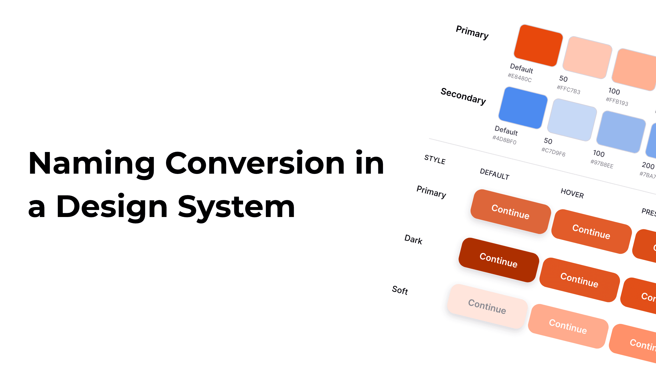
When creating a design system, names should never be based on personal preference or literal visual values. Instead, they must be based on role, implementation, and usage context.
Avoid literal values: "blue", "dark-navy", or "16px"Use semantic intent: "color-action-primary", "bg-primary", or "space-component-padding"
Why Design Tokens Matter
Design tokens provide teams with a single source of truth, bridging the gap between designers and developers. They streamline implementation and allow updates to propagate across an entire project effortlessly.
Semantic naming enables team members to reach for the right option without memorizing underlying hex codes or pixel values:
"I need the primary action color" is much faster and safer than "I need
#3B82F6unless we updated it recently."
Why Naming Conventions Matter in a Design System
Adopting a structured naming convention across your design system delivers four main advantages:
Clarity and Readability: Intuitive names help team members immediately understand an element’s function, boosting team efficiency.
Consistency: Standardized naming establishes a predictable flow across platforms, ensuring a unified user experience.
Scalability: A clear structure allows you to manage new elements gracefully and maintain order as the project grows.
Enhanced Collaboration: Using a shared vocabulary aligns designers and developers throughout the entire production lifecycle.
The 8 Key Elements of Design System Naming
To build a comprehensive design system, establish naming patterns across these primary levels:
1. Design Tokens
The foundational variables defining visual properties (colors, typography, shadows, spacing). Token names must strictly reflect their semantic role rather than visual appearance.
2. Components
The basic, reusable UI building blocks (e.g., buttons, input fields, cards). Standardizing component names ensures seamless design-to-code handoffs.
3. Patterns
Combinations of components that form reusable UI layouts or workflows (e.g., NavBar, LoginForm, ConfirmationDialog). Naming should directly reflect the layout's functional purpose.
4. Modifiers
Variations in size, color, or behavior applied to a base component or token. Modifiers typically follow a BaseComponent–Modifier pattern.
- Examples:
ButtonPrimary–Large,ColorPrimary–Dark,Card–WithShadow
5. States
Specific component conditions during interaction. State names clearly communicate the active context within the UI.
- Examples:
Button–Disabled,Input–Error,Link–Active
6. Responsive Variants
Component or layout adjustments tailored to specific viewport sizes or device types.
- Examples:
Button–SmallScreen,Grid–Desktop,Image–Responsive
7. Accessibility Features
Tokens or properties explicitly dedicated to enhancing accessibility standards.
- Examples:
Button–AriaLabel,Text–HighContrast
8. Brand & Theme Variants
Elements specific to sub-brands, white-label products, or alternate themes.
- Examples:
Button–BrandA,Navbar–BrandB,Typography–Corporate